
Kirlin Lighting Brand Refresh
Shining new light on the leader in specialized lighting solutions.
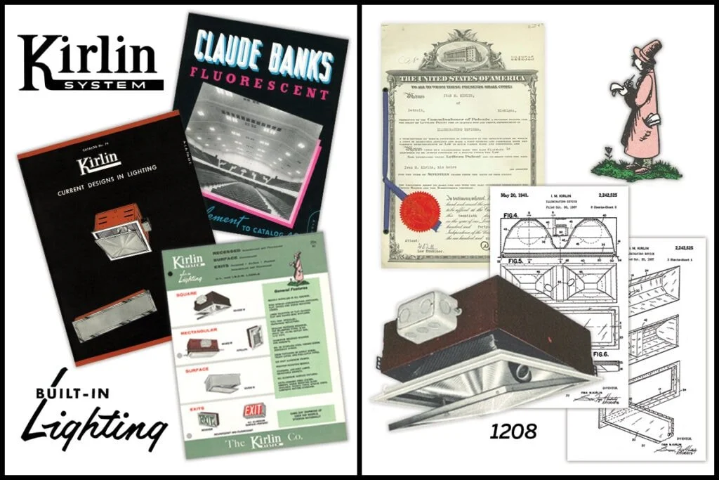
For the past 125 years, Kirlin Lighting has been manufacturing innovative lighting solutions. They have a heavy focus in the medical industry, and deliver high-quality, specialized lighting with strong consideration for the experience of the end users of their products.
For this project we had two specific goals, (1) to modernize the brand image and (2), to help Kirlin capture a larger share of their audience in online search. After the brand update, we built of an 11-page healthcare microsite focused on what they’re best known for—medical lighting.
MY ROLES:
Creative Direction
UX Design
Information Architecture
TOOLS USED:
Adobe
Sketch
Invision
TARGET AUDIENCE
Lighting professionals highly skilled in lighting/electrical engineering.
If a building requires sophisticated lighting decisions, they bring in lighting specifiers to choose lighting:
Specifiers bridge the gap between architectural vision and final product selection
Ensure the right light is delivered safely and efficiently for a space
Responsible for how lighting looks and how it performs over time while staying in budget
THE CHALLENGE
Kirlin innovates where it matters most, even if it’s not immediately visible.
Historically Kirlin has been known for their innovative products of exceptional quality, but were concerned about declining brand perception:
Old look and feel across touch points was not conveying the messaging/content/level of professionalism Kirlin had been known for
Need to combat the perception that Kirlin is not as technically advanced as they used to be
Win back specifiers who have overlooked Kirlin recently to give them a second chance
APPROACH
Updating a 125-year-old Brand Image
BRAND RESEARCH + BUSINESS OBJECTIVES
To fully understand the lighting industry and company history needs, I conducted a few interviews with stakeholders in the family business and learned:
Understand Kirlin’s differentiators: their long history of engineering-led product development, and ability to customize features that allow specifiers to achieve their designs without compromising
Perception in the market that Kirlin has “lost their stride”: audience believes they haven’t maintained the degree of innovation that they used to have
Company wants to focus on healthcare and speciality applications: spaces where quality and performance are valued
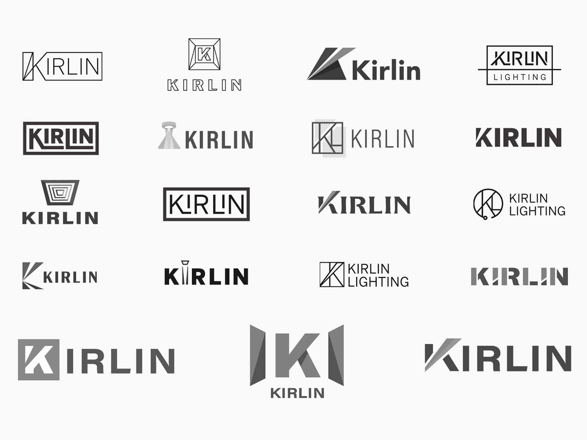
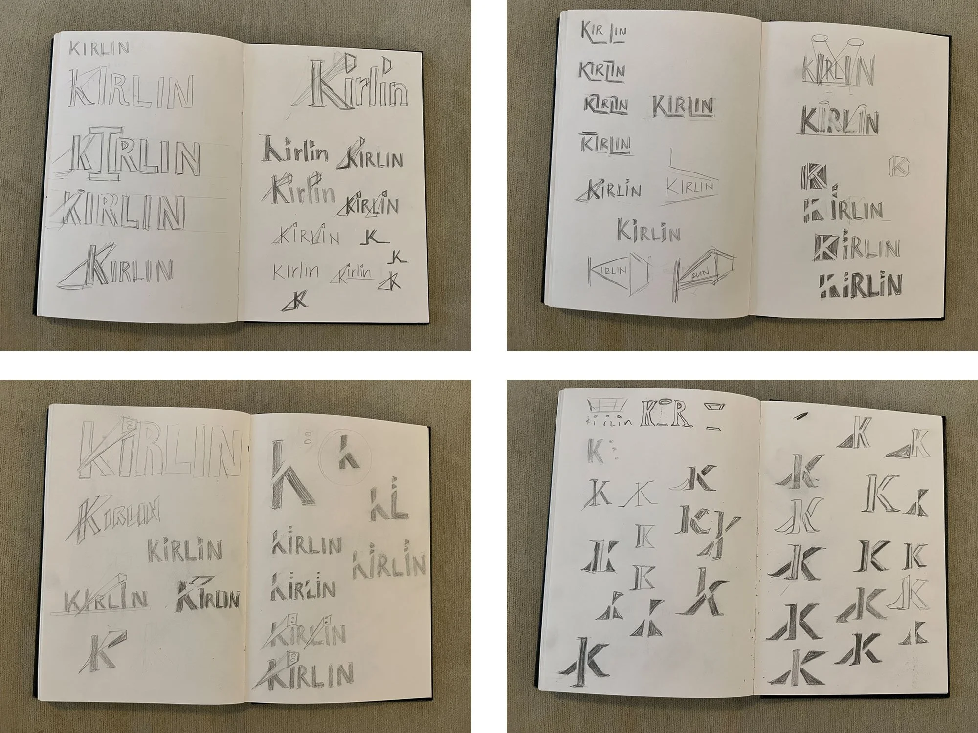
SKETCHING + IDEATION
Reviewed competitors in the specialized lighting space
Reviewed and referenced the 125-year-old brand legacy
Explored different design avenues, such as echoing the shapes of popular lighting products, directions of light to carry the eye, and more
Aimed to balance of Kirlin’s known, historic brand presence while evolving its look to bring the company into its next chapter
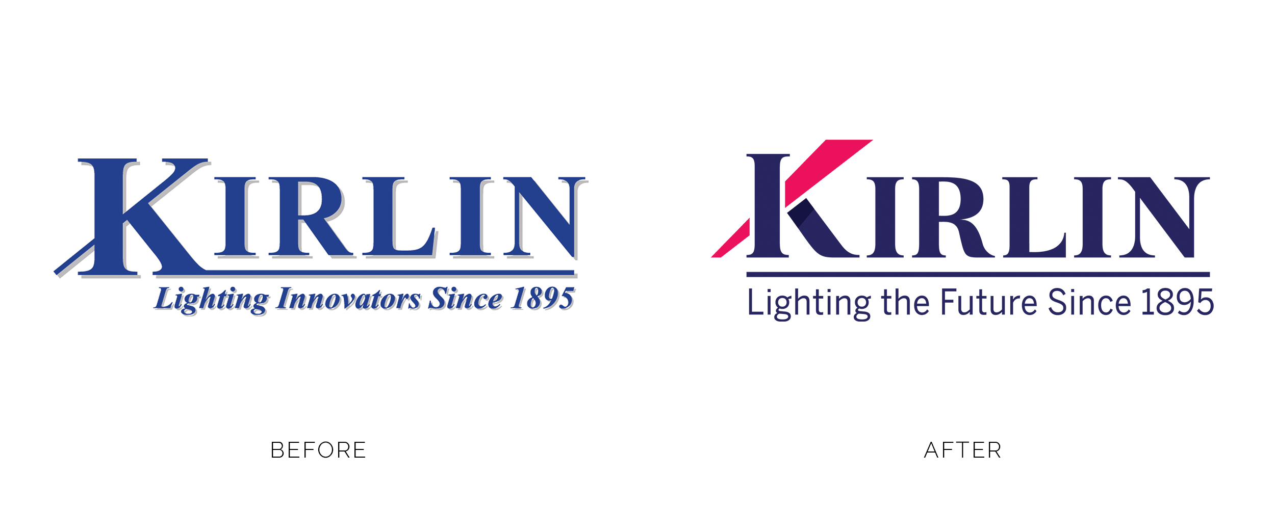
RESULTS
We conducted a strategic, creative refresh of the historic Kirlin Lighting brand to modernize their brand presence and expand their visibility in online search, focusing on their specialized medical lighting solutions.
This refresh included:
Updated Brand Identity: modernized the entire look and feel of the parent company and its sub-brands. We introduced an expanded design system while maintaining the integrity of the historic brand.
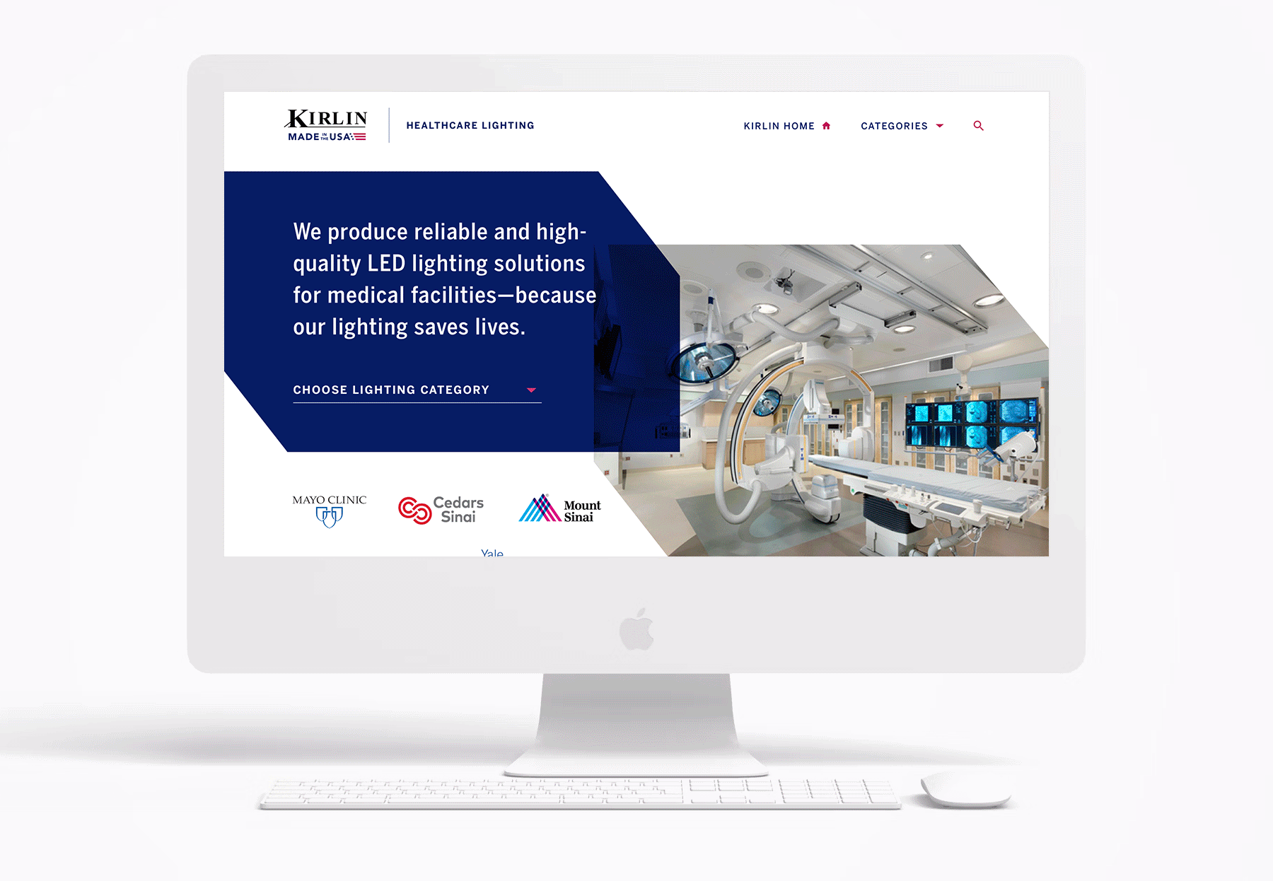
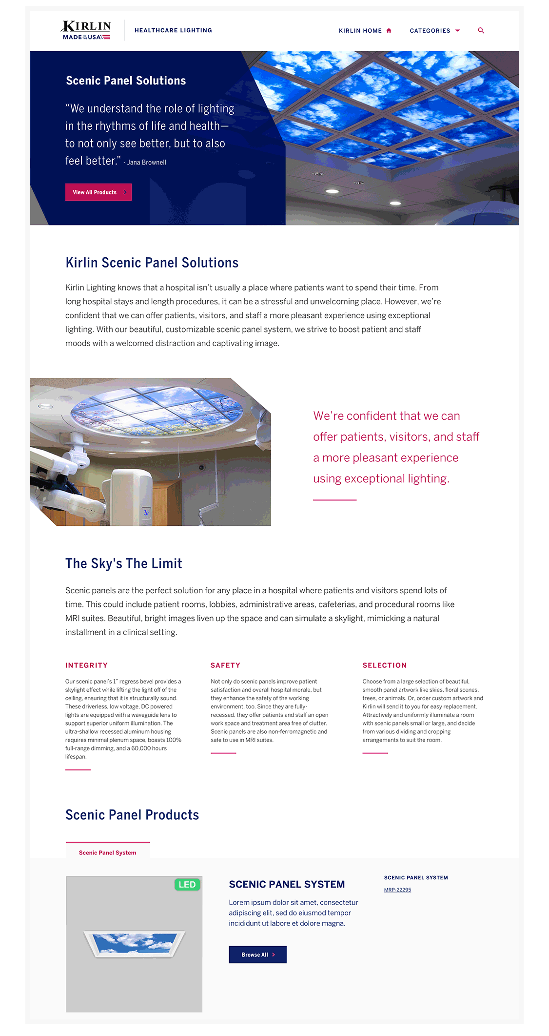
New Healthcare Microsite: Designed and delivered an 11-page pilot microsite focused on Kirlin’s healthcare lighting expertise. This involved updating the entire experience, from the SEO content strategy to the information architecture and layout to improve user experience and improve search rankings.
Updated SEO strategy: Updated the content and architecture to better capture organic traffic, driving measurable growth in both increased visibility and engagement.
11
New Pages
Designed, Developed & Delivered
2,178
Product Views
Driven by the healthcare microsite to the product catalog
9.6%
Conversion Rate
From the healthcare microsite to a product detail page on the primary site
53%
Traffic from Organic Search
15,000 visitors were from organic search results, or 53% of overall traffic
Google Analytics performance data from 2021-2022
LOGO REDESIGN


IDENTITY SYSTEM
Master brand › Lighting division › Product line

Main logo + tagline

Product Division

Product Line

Made in USA badge

HEALTHCARE MICROSITE
NEW MARKETING MATERIALS
Collateral created by the internal marketing department using the new brand guidelines


